A Portal Patients Actually Use
Published
Most patient portals fail the same way. They are built as a compliance checkbox or a marketing feature, launched with fanfare, and then quietly abandoned by the people they were meant to serve. Patients log in once, cannot find their report, hit a dead end, and never return. The clinic concludes that patients "do not want digital," which is exactly the wrong lesson. Patients want the specific things a portal can do for them. What they do not want is a second, worse version of the hospital's paperwork, dressed up in a login screen. A portal patients actually use starts from what the patient came for, not from what the IT roadmap wanted to tick off.
Start from the three things patients actually want
Walk up to someone in a waiting room and ask what they wish they could do without calling the hospital, and you will hear a short, consistent list. Not a feature matrix - a handful of real needs:
- See my test results as soon as they are ready, and understand what they mean.
- Book, move, or cancel an appointment without waiting on a phone line.
- Get my prescription and discharge instructions in a form I can actually read later.
Everything else is secondary. A portal that does these three things reliably will be used every week. A portal that does thirty things badly will be used once. The discipline is to make the common path effortless and to resist burying it under features that sound impressive in a demo and matter to almost no one.
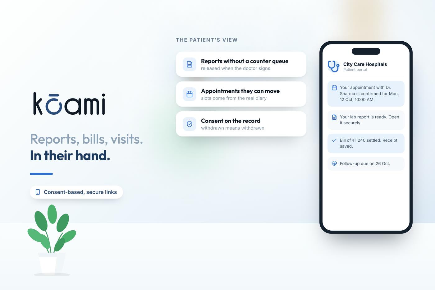
Kōami's approach is to treat the portal as the patient-facing surface of the same record the clinicians use, not a separate island that has to be manually synced. When a result is finalised in the lab, it is available to the patient. When an appointment moves, the patient sees the new time. There is no overnight batch, no re-entry, no divergence between what the front desk knows and what the patient can see.
Results that explain themselves
A lab value on its own is a source of anxiety, not information. A patient who sees "14.2" with no context will either panic or ignore it, and both are bad outcomes. The portal has to do a little of the work that a good clinician does at the bedside: show the reference range, flag whether the value is in or out of it, and where possible give a plain-language line about what the test was for.
A result the patient cannot interpret is not transparency. It is just a number that generates a phone call.
There is a judgement call here, and it is worth making deliberately. Some results should reach the patient through their clinician first, not as a raw notification at eleven at night. A sensible portal lets the clinical team set the release rules - immediate for routine results, held for review on the sensitive ones - so that transparency does not come at the cost of a patient reading life-changing news alone and unsupported. Kōami supports that graduated release rather than treating every result the same way.
Appointments the patient can actually manage
Booking is where most portals quietly break. They show a calendar that is not really the clinic's calendar, so the patient books a slot that does not exist, turns up, and finds the doctor on leave. Trust, once broken that way, does not come back. The booking surface has to be the real schedule - the same slots the front desk sees, with the same holds and the same rules.
Done properly, self-service booking takes load off the phone lines and gives the patient control at the same time. They can:
- Book into a genuinely available slot for the right department and doctor.
- Reschedule or cancel within the clinic's own policy window.
- Get a reminder ahead of time, and a simple way to confirm they are coming.
- See their upcoming and past visits in one place, tied to the same token and queue flow they will meet on the day.
Because the portal shares the OPD scheduling and queue system, a booked appointment carries through to the token the patient receives on arrival. The online action and the physical visit are the same thread, not two systems the patient has to reconcile.
Instructions that survive the car park
Some of the most important minutes of a hospital visit happen in the last ten, when a tired patient is handed a prescription and a set of instructions and told to follow them at home. By the time they reach the car park, half of it is forgotten. This is where a portal earns its keep quietly and permanently.
The discharge summary, the medication list with timing, and the follow-up plan should all land in the portal automatically, drawn from the same records the clinical team finalised. Not retyped, not a scanned photo of a handwritten note, but structured, legible, and available at two in the morning when the patient's daughter is trying to remember whether the tablet was twice a day or three times. Kōami links the portal to the discharge and prescription flow so this content appears without anyone re-keying it.
That connection matters more than it first appears. When instructions live in the portal, the family can act on them, the patient is more likely to actually take the medication correctly, and the clinic gets fewer confused callbacks the next morning.
Designing for the patient who is not tech-confident
A portal that only works for the youngest, most digitally fluent quarter of patients has failed the majority who need it most. The design has to assume a tired, anxious, sometimes older user on a mid-range phone with patchy signal. That means large tap targets, plain language, minimal steps to the common tasks, and graceful behaviour when the connection drops. It means not forcing a password reset odyssey to see a blood test. And it means the front desk can still do everything on the patient's behalf, so the portal is an addition to human help, never a replacement that leaves the less-confident stranded.
A portal patients actually use is not the one with the longest feature list. It is the one that shows results they understand, lets them manage appointments against the real calendar, and hands them their instructions in a form that survives the journey home. Build those honestly on top of the same records the clinicians trust, and the login screen stops being a dead end and starts being the front door people choose.
Follow Kōami on LinkedIn
Get the next guide on hospital operations, software and compliance in your feed, as soon as it is published.